I am sure all of us, at least once in our life must have prepared a PowerPoint Presentation.
We are generally introduced to PowerPoint presentations in middle school. Our teachers give us different projects to be made in the PPT format and present it in front of the class.
Even big corporates use PowerPoint presentations to pitch an idea, draw up a sales plan, explain the company’s growth report, etc.
What I am saying is, no matter which phase of life you are in right now, you are going to be giving presentations. And, if you really want people to resonate with you, you need to have a solid presentation.
Many people concentrate more on the visual aid (your PPT) than the audio aid (your speech).
That is why, not only do you need to communicate your message or idea through your words, you also need to get through to the audience with your presentation.
There are some presentations given by great orators that just blow your mind and leave you mesmerized.
For example, Mr. Steve Jobs on the launch day of the iPhone in 2007 amazed the audience with a presentation that consisted only of pictures.
It started with the apple logo and then showed the journey of the company from the launch of the Macintosh in 1984, concluding with the launch of the iPhone in 2007.
The presentation skills of Steve Jobs and many others are studied by millions of people from different walks of life.
All I am saying that PPT skills are very important in this day and age. You need to have a powerful presentation to make an impression on the audience.
That is why I have some awesome tips for you, which will help you make that impact on the audience.
Table of Contents
- Less is More – Space out your slide
- Simplicity is Key – Use Basic fonts
- Avoid using too many colors in one slide
- A picture speaks 1000 words
- Use animations, but don’t overdo it
- Make sure all video links embedded in your PPT are working
So, without further ado, let’s get started with the tips.
#01 Less is More – Space out your slide
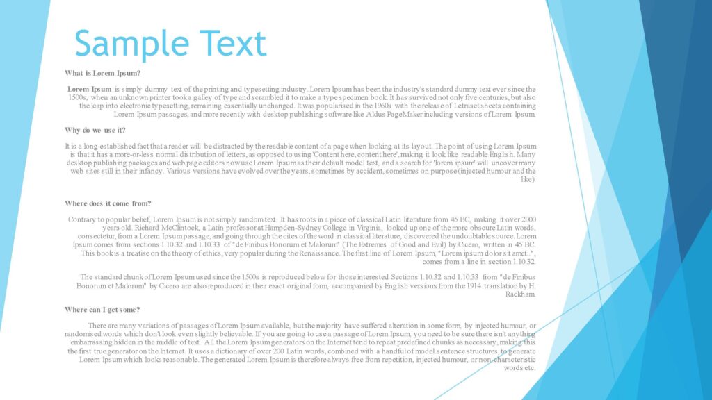
People have the habit of putting in a lot of data into one slide. This makes it very difficult for people to read as you speak.
Just imagine you are sitting at a distance of 20 feet from a normal-sized projector.
Now, the speaker starts his presentation and every slide is filled with text.
Will you be able to read everything on the slide?
Are you going to be able to read the slide while the speaker is talking?

Probably Not.
Somewhere an idea gets implanted into people’s minds that if a slide has a lot of data in it, it means you know the topic well and you have also done a lot of research.
But that is not the vibe that the audience is going to be getting.
While writing onto a slide just follow the below principle:
“Less is More”
A few tips on filling data onto the slide are the following:
- Explaining a Concept
If you want to explain a particular concept when you come to that slide, then just add the bullet points in the slide.
The explanation should form part of your speech.
If you fill the slide with all the explanation, you are indirectly discouraging the crowd to read the slide.
The audience might also get annoyed with the shabby slide and also not listen to what you want to say.
- Case Study/Personal Experience
Giving an account of a personal incident or going through a case study gives more depth to your presentation.
In this case, you might just want to include a picture that depicts what you are about to say and skip writing any text (Just like Steve Jobs did on the launch day of the iPhone).
- Definitions/Meaning of Terms
Usually, people start with the definition of a certain term or the common usage of the same.
The most common way of presenting this in a slide is typing out the definition. Definitions are generally short so there is not too much text and it is easily visible to the audience.
However, your presentation will not stand out if you follow the ordinary.
Instead of simply typing out the definition, you could begin with a very short animation or video that stirs the idea of the topic in the minds of the audience.
Another idea is to begin with a picture that does not have a direct relation to the topic, but a significant indirect relation that only you have thought about.
This will get the audience thinking and they are going to most likely listen to you right till the end of the presentation since you have now got them interested.
A pro-tip here would be, if you are still wondering what kind of slide to put in for a particular part of your speech, do this:
Close your eyes and imagine yourself as part of the audience.
Now, imagine a white slide in front of you. As the audience, what would you like to see there?

That’s your answer.
#02 Simplicity is Key – Use basic fonts
Some of you might have a notion that the more fancy looking a presentation is, the more it is going to impress the audience.
However, the reality is quite the opposite.
Steve Jobs made one of the most iconic presentation with just a couple of pictures. He did not use any animations and no design.
What does that tell us?
The real magic is in what you speak. Your presentation is a powerful tool only to enhance your speech. It is not the speech itself.
My point is, use basic fonts that are simple and legible from a distance. My personal favorite is Times New Roman.
You can use whichever suits your presentation.
Just bear in mind that, the font should be easy to read from a distance. For instance, don’t use fonts like Chiller and Jokerman because they are not easily legible.
Another important thing to note here is, don’t use very loud fonts. An example of a loud font is Goudy Stout.
This might make the audience nervous subconsciously and they may lose focus from your presentation.
#03 Avoid using too many colors in one slide
The reason for this is that people might get distracted by the various colors and they might not focus on the actual content.
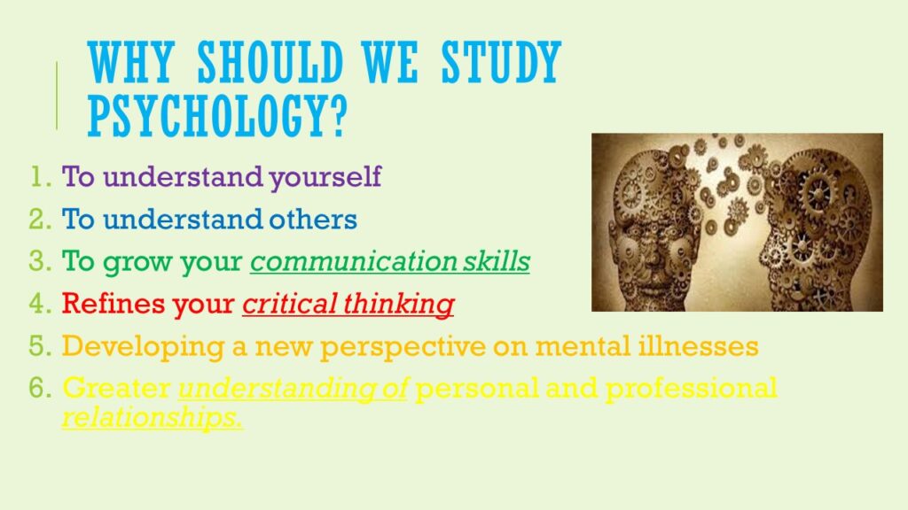
I had this habit of putting the different bullet points in the colors of the rainbow.
However, I noticed that as soon as I came on to that slide, the audience were amazed with the color scheme and they continued to admire it while I spoke.
While it’s a good thing that the audience likes your slide, but it should not be for the wrong reasons.
When I put up the rainbow-colored slide, the crowd was less interested in what the slide was about and more fascinated about the different shades of color that I had used.
If the topic of your presentation relates to design or animation, then using different colors and patterns should definitely be used to illustrate your point.
But on the other hand, if your topic has nothing to do with design, try to create simple yet impactful slides.
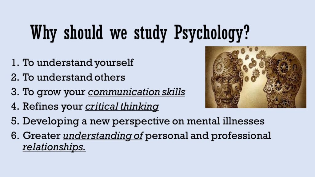
Do you see a difference between the two slides below?


I am very sure that in the first picture you were reading the content, but when you came to the second picture, you started admiring the color scheme.
My recommendation would be that, you can use a maximum of two colors in one slide. Any more than that will distract your audience.
If you are still apprehensive about your presentation being too flashy, take a third party opinion. You can send your presentation to a friend or a colleague and see what they have to say.
#04 A picture speaks a 1000 words
I have mentioned this earlier as well. Instead of using a lot of bullet points and explanations, use pictures.
People are definitely more likely to remember that picture on your slide and what you spoke about it than all the paragraphs and definitions.
Moreover, it is very difficult to listen to the speaker and read the slide. That is why most of the time, the audience only does one of two things.
They either listen to you and ignore the presentation or they read the presentation and ignore what you are saying.
But if that happens, one of the things you are doing is a waste.
Hence, to make the most use of all your resources, make it memorable for the audience. The easiest way to do this is to put yourself in the shoes of the crowd.
Think about what you are going to say and then search for the relevant picture.
There is one thing though, that should be kept in mind.
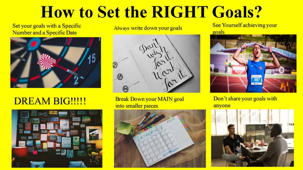
Any slide in your presentation should not have more than 4 pictures. If your slide has more than 4 pictures, the effect is going to be the same as that of using too many colors.
People will get distracted with all the pictures and they will not listen to what you have to say.

There are some other tips as well, which should be kept in mind while using pictures:
- While selecting your pictures, don’t put any adult content onto your slide. At times, you might not know everyone that is forming part of the audience.
- If you are planning to use any funny picture or memes from social media, bear in mind the nature of the audience. No one should feel offended.
- Try using copyright-free pictures as far as possible.
- If you are using the pictures of politicians or any other famous personalities, see to it that you are using it in good faith and not for any defamatory tactics.
- Keep the resolution of all your pictures at the maximum, so that it is clearly visible even from a distance.
- If you have text and pictures both on one slide, ensure that it is properly spaced out and the image is not too tiny.
Using images is definitely going to benefit your presentation, but before you put any image in your presentation, be sure that you are following all the above guidelines as well.
#05 Use Animations, but don’t overdo it
I would say the animation feature in Microsoft PowerPoint is a boon and a bane.
This is because there are only 2 kinds of people, one – who don’t use animations and the others – who give animations to every word.
Just Kidding ?
But coming back to the point, I have seen a lot of presentations where too many animations have been used.
While you should use animations to enhance your PPT but going overboard with it will only irritate the audience.
On the other hand, you are also going to have to keep clicking the next button, if you have put in too many animations.
Now, there is no set benchmark on the number of animations that should be embedded on a particular slide.
But don’t worry, I think I can help you with that.
On average I would say that, if you have to click on the next button more than 3 times for the whole slide to appear, then you are going overboard with it.
However, that being said, if you spend a lot of time on the same slide, and you are clicking the next button more than 3 times it’s fine.

I have just given a rough estimate, it will vary depending on the amount of time you plan to speak on 1 particular slide.
Just keep one simple thing in mind, if you have to go to the next animation only after speaking for about 10 seconds, then you are overdoing it.
Is it safer not to use animations?
Yes absolutely, it is definitely safer to use no animations that using too much of it
#06 Make sure all video links embedded in your PPT are working
If I had a dollar for, every time I was waiting in the audience for a video link to open and it ultimately does not, I would be a MILLIONAIRE.
Ok, I was kidding again ?
But, when there is a video link in your PPT, you have already spiked up the hopes of the audience because everyone loves watching videos.
And when the link does not open, you have actually upset them.
The most common mistake I have seen people committing is that, when you are transferring the PPT over mail or copying it on the pen-drive or any other external device, you forget to copy the video files as well.
The link will open only if it exists on that device.
That is why, just before you start with the presentation, you must check whether the video link is opening.
And in the worst case scenario, it is not opening, and you can do nothing about it, DELETE the link from the slide, don’t leave it there.
This is because like I mentioned when the crowd sees that there is a video link on the slide, they are going to want to watch.
And then when you tell them that it is not working, they are going to be disappointed.
On the other hand, if they didn’t know that the link existed, they will have nothing to be upset about.
So, make sure you check all links on your presentation before you start.
That is, it from me.
I hope this article helps you prepare better and more impactful presentations in the future.
If you are preparing for an upcoming presentation, you might also want to check out the 6 Tips for Drafting a Good Speech
Do let me know in the comments below, if you have any other suggestions and if you do consciously practice any of the above tips.
Have an awesome day ahead.
We’ll meet again at the same place with another insightful article.
Until then, Happy Reading ?


One thought on “Are you struggling with your PPT? READ THESE 6 amazing tips!”
Comments are closed.